혼자하는개발공부/CSS
드림코딩 엘리 3강:Flexbox 완전정리
언홀리
2021. 7. 18. 14:26
css 3강
study date:2021.07.13
css 기초 강의 3편
float
:정렬이라고 생각하면 편함 left, center, right
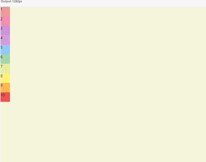
Flexbox 구성요소들
container, item 속성을 따로 지정한다.
수평축, 수직축이 있다. 하나는 중심축 하나는 반대축이다.
축은 수평이냐 수직이냐에 따라서 바꿔질 수 있다.
<!DOCTYPE html>
<html>
<head>
  <meta charset="utf-8">
  <meta name="viewport" content="width=device-width">
  <title>JS Bin</title>
</head>
<body>
   <div class="container">
        <div class="item item1">1</div>
        <div class="item item2">2</div>
        <div class="item item3">3</div>
        <div class="item item4">4</div>
        <div class="item item5">5</div>
        <div class="item item6">6</div>
        <div class="item item7">7</div>
        <div class="item item8">8</div>
        <div class="item item9">9</div>
        <div class="item item10">10</div>
    </div>
</body>
</html>
.container{
background: beige;
height: 100vh;
}
.item{
width:40px;
height: 40px;
}
.item1 {
background: #ef9a9a;
}
.item2 {
background: #f48fb1;
}
.item3 {
background: #ce93d8;
}
.item4 {
background: #d39ddb;
}
.item5 {
background: #90caf9;
}
.item6 {
background: #a5d6a7;
}
.item7 {
background: #e6ee9c;
}
.item8 {
background: #fff176;
}
.item9 {
background: #ffb74d;
}
.item10 {
background: #ef5350;
}
.container{
background: beige;
height: 100vh;
display: flex;
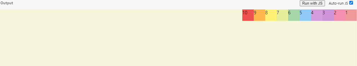
flex-direction: row-reverse;
}container를 flex박스로 지정하고 메인축을 가로축 혹은 수직축으로 정한다.
.container{
  background: beige;
  height: 100vh;
  display: flex;
  flex-direction: row;
  flex-wrap: nowrap;
  flex-flow:column nowrap;
  /*flex-flow는 flex-direction과 flex-wrap를 합하여서 사용함.*/
    justify-content:space-between;/*중심축에서 아이템을 어떻게 배치하는지 알게해주는것 */
    align-items:center;/*반대축에서 아이템을 어떻게 할지 결정하는것*/
    align-content:center;
}
flex 박스 개념 확인해보는 사이트
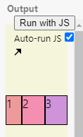
item 구성요소들
<!DOCTYPE html>
<html>
<head>
  <meta charset="utf-8">
  <meta name="viewport" content="width=device-width">
  <title>JS Bin</title>
</head>
<body>
   <div class="container">
        <div class="item item1">1</div>
        <div class="item item2">2</div>
        <div class="item item3">3</div>

    </div>
</body>
</html>
.container{
padding-top:100px;
background: beige;
height: 100vh;
display: flex;
}
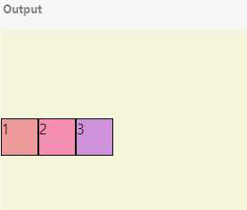
.item{
width:40px;
height: 40px;
border: 1px solid black;
}
.item1 {
background: #ef9a9a;
}
.item2 {
background: #f48fb1;
}
.item3 {
background: #ce93d8;
}
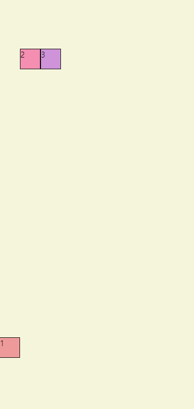
css item에 order로 순서변경가능
.item1 {
  background: #ef9a9a;
  flex-grow: 2;
}

.item2 {
  background: #f48fb1;
  flex-grow: 1;
}

.item3 {
  background: #ce93d8;
  flex-grow: 1;
}
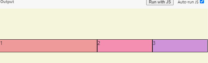
item1은 flex-grow를 2로 줬는데 item2,3 보다 2배씩 커지게 되는 것이다.
.item1 {
  background: #ef9a9a;
  flex-grow: 2;
  flex-shrink: 2;
}

.item2 {
  background: #f48fb1;
  flex-grow: 1;
}

.item3 {
  background: #ce93d8;
  flex-grow: 1;
}
grow와 shrink는 컨테이너의 사이즈가 바뀌었을 때 아이템이 얼마나 어떻게 더 줄어들고 늘어나는지 정의하는 항목이다.
.item1 {
  background: #ef9a9a;
  flex-basis: 60%;
}

.item2 {
  background: #f48fb1;
  flex-basis: 30%;
}

.item3 {
  background: #ce93d8;
  flex-basis: 10%;

}
container의 width에 따라서 60, 30, 10 퍼센트로 나눠서 자리를 차지한다.
.item{
  width:40px;
  height: 40px;
  border: 1px solid black;
}

.item1 {
  background: #ef9a9a;
  align-self:center;
}

.item2 {
  background: #f48fb1;
}

.item3 {
  background: #ce93d8;


}
align-self: 아이템 하나만 배치할 수 있다.
Basic concepts of flexbox - CSS: Cascading Style Sheets | MDN
→ flexbox mdn 문서 참고